
Want to create the effect as if you’re writing using chalk? With the Chalkduster font, you can. This post lets you download the one and only, the most popular, Chalkduster Font in .ttf format. You can download and use this font for your personal projects to create chalk writing style text. This is the regular version of Chalkduster font and is free to download. We also provide images to give you a hint on how Chalkduster font will look on a blackboard or similar background. (Or if you use Chalkduster font on a black background, it will look quite similar to as shown below.)
Check out more chalk duster font click HERE.

Ever been working on a design and wished there was something that could enhance your image? Perhaps an effect to make the picture more amazing. Yep, we’ve all been there. Lucky for you and us, there are tons of elements that you can use to make the finished product more awesome.
So if you’re looking for a free font that lets you write in the style of chalk text, you might want to check this out. Have you heard about Chalkduster font? It’s like you’re writing with chalk on a blackboard. A popular writing effect that lets you create chalk-like text patterns easily in just seconds. And did we mention it’s free? (We also have one that let’s you write with crayon-like effects.)
Good Quality, Easy to Use, Free!

If you’re like us, we like the free stuff. And not just that, we’re also after good quality. What’s more, we want something that’s easy and fast to do. With the Chalkduster font, it’s as simple as pie. What a great way to enhance your images without hassle. And without cost to you. Coz it’s free!
When you want to become a better communicator through images and words, give Chalkduster font a try. Or you could also visit some of our other featured effects to help you enhance your design. In the meantime, we offer these graphic design hacks. (Here’s a set that’s inspired by the menu board in cafes.)
With these simple tips, we hope to help you become a pro at graphic design overnight. From fonts to pictures, we aim to have these easy-to-follow pointers empower you in creating amazing graphic designs.
Easy-As-Pie Graphic Design Hacks for Designers and Non-Designers
The internet is a game-changer. It offers a lot of information that isn’t usually available in libraries or classrooms. Case in point: graphic design.
Like most people, a lot of the guys in our team are self-taught in graphic design. Sure, some of us took basic classes and even crash courses. But a huge chunk of our graphic design knowledge came off the internet. After all, it’s a highly accessible avenue with lots of helpful information to offer (not to mention an open archive of design elements just like the Chalkduster font). Plus, it’s free!
In this list of graphic design hacks, we want to share the knowledge we gained from online resources as well as the things we learned through our everyday interaction with friendly internet folks. So without further ado, here are tips that will make you a pro and a superstar overnight at graphic design.
How to Pair Contrasting Fonts and Image Elements
This particular area in graphic design stumps many people. Failing to recognize what blends with what may result in appalling work, if not completely abysmal. This is something you should avoid, and it is avoidable. Take the case of the Chalkduster font. The font color is white, so it’s not a good idea to pair it with a background with a lighter shade.
To swerve away from this pitfall, choose your font styles with high contrast yet still maintain a delicate balance in the design features. Be mindful of the differing sizes of the various font styles to distinguish the principal text from the supporting ones.
Mix and Match the Colors
Color harmony is another critical factor when attempting to achieve a seamless balance in your design. To effectively make your design stand out, match the font, text holders, and other graphic elements with your background image.
Beautiful Layouts with Grids
Want to create an eye-catching composition? Try using grids. You can separate multiple images with similar themes by placing them in individual grids. If the subject of your photos involves the horizon, make sure you line them up well.
Play with Shapes and Icons
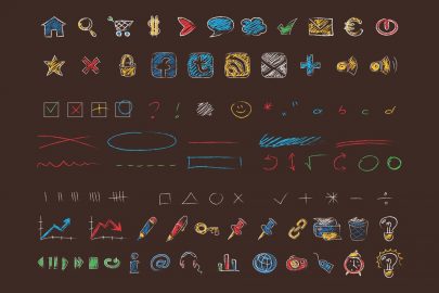
You’ll be surprised how well you can create awesome images with shapes and icons. This is particularly applicable when looking to illustrate reports and statistics and such. Shapes and icons are a great way to emphasize crucial data while making it interesting at the same time.
If you’re looking to creating an informative post that’s not too boring for your audience, you might want to play with these graphic design elements in your next presentation.
Addressing Color Issues in Your Images
Saturation is a key element when fixing the color issues in your design. However, the decision to make images vivid or dull, bright or pale, is best left to your discretion. But if you want to make the subject of your design to become richer, we recommend intensifying the hues. Otherwise, you risk making your images appear muted and washed out. In the case of the Chalkduster font, having a pale-colored background may not be a good idea.
Play with the Crop Option
If you’re planning to add copy over your background images, play with the crop option. Little overlay text may mean a lot of white space in the background. On the other hand, lots of text may result in a crowded look.
So if you have little text over the images, crop it to minimize the white space. Or if you need more copy space, maximize it by increasing the size of the images.
Consistency Is Key to Branding Using Various Images
If you’re creating multiple images for branding purposes, stick with a single theme. Consistency through visual cues helps with brand recognition. The repetitive placement of design elements and the way the text and color palette are patterned are crucial elements that contribute to better communication to the targeted market audience.
Incorporate Visual Assets That Are Apt for Social Media Use
Virtually every single person on earth has a social media account. Whether it’s Facebook, Instagram, or Twitter, it is a very powerful platform that reaches us in our everyday lives. So why not create design elements fit for social media use?
Conclusion
Would you like to have more free graphic design effects like the Chalkduster font?Want to develop your graphic design skills? Need to create visual designs or presentations? Get in touch with us. We can advise you on ideas that can make your graphics stand out.
Check out our website for more content like this.
Check out our other mockup templates.
- 65+ Photoshop Brochure Template Collection You Can Download for FREE!
- Cool Postcard Mockup Templates
- Best PSD Flyer Mockup Designs You Can Download for FREE!
- Tote Bag Mockup Templates for Your Online Shop