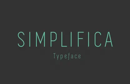
Wondering what’s the best typeface you can use for your designs? Check out Simplifica font. Exclusively designed and released by KAIWA, this font is fine and clear. You’ll love its beautiful simplicity.
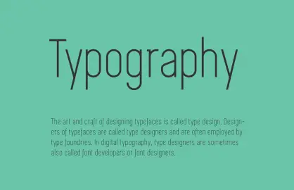
Kaiwa has produced yet another fantastic free font that is a modified version of sans-serif. The Simplifica font features a slightly condensed sans-serif typeface with uniform and thin line widths.
Its caps-height and ascender ensure easy reading. All in all, the Simplifica font is a fine, simple but clear font with usage ranging from websites to print.
Check out more Diverse Stories of the Simplifica Font click HERE.
Uses of Simplifica Font

Print Ads
As a free font, Simplifica is quickly finding its way among marketing materials. The absence of sharp angles makes it seem flowing and easy on the eyes. When used in marketing, Simplifica sets the stage for the steady flow of ideas over a friendly tone in bringing messages across.
Websites
The compactness of the Simplifica font may not make it the best choice for blogs, but it will do well with website menus and headlines.
Personalized Artwork
Simplifica is free, so anyone can download it and have immediate access to it. You can use it to create personalized artwork without paying a cent. Plus, easy access to 3D printing can make it possible to use Simplifica font in building maze-like structures of favorite expressions.
Food
Who would have thought that you can make food using Simplifica font? Again, a 3D printer would prove to be extremely handy because you’ll need it to create font cookie cutters.
Just follow your favorite recipes and don’t forget to cut your cookies using Simplifica font cutters.
Check out: 19 New Free Fonts Released in July 2021 – Free Download
Other Fonts
Is the Simplifica Font Not What You’re Looking For? Don’t worry; many other free fonts have been released!
Listed below are a variety of free fonts that can be used in different applications. These fonts have been released in April 2016. Many new additions can be noted since.
Bornhardt
Bernhardt is characterized by a bold yet curvaceous sans serif typeface.
Metafors
The Metafors is a handwriting font. It is light, authentic and a little clumsy-looking, too.
LeParisien
LeParisien is yet another handwriting font. It is known to be excellent Giles and is used in early years classes.
Hovel
The Hovel font is a type known for its wild interface.
Sequel
Another offshoot of the sans-serif font is the sequel. The sequel is a bold and rounded font that comes with ligatures for the words “the” and “of.”
Yikes
Yikes is a new font that is rounded and ideal for logos, posters, and headlines.
Montano
Montano is a handwriting font that is slanted and with noticeably wider kerning.
Draft Display Font
The Daft Display font contains uppercase and lowercase letters. It is a font ideal for headlines.
Exan-3
The Exan-3 features a contemporary look and monospacing.
Awadh
Awadh is a font that is hand-drawn but with lots of charm and personality. This font gives you vintage vibes. It is best for quotes, logos, t-shirts, and posters, among others.
Westchester
The Westchester font features a quirky brush print. Its wet brush style is perfect for posters, labels, logos, and so on.
Little Creator
The Little Creator is an artsy deviation from the sans serif font.
Capsule X Pro
The Capsule X Pro is a font inspired by mental peace, motivation, and self-esteem. Hence, its capsule theme. The design is highly readable but at the same time, compact.
Sprightly
The Sprightly font is wide, neat, and has double-lowercase ligatures. It is a semi-connected handwritten script font that adds a stylish feel to your design.
AC Line
The AC Line is a sleek font with a thin but tall front. It is recommended for projects that require big font sizes.
Blern
Blern is a font that is thin and geometric. Its letters are proportional; thereby looking all neat and even.
Check out: 22+ Free eCommerce WordPress Themes with Shopping Cart
Black Willow
The Black Willow font has a rustic appeal to it. It is inspired by vintage lettering. The Black Willow font comes in two styles, namely Regular and Rough.

FAQs
1. What Are the Look and Feel Desired?
Selecting the font used in any print ad or website is not rocket science. The best approach is to match the feeling of the font with what you want to provoke using your visual. You can use A/B testing during this stage to spot the right and wrong fonts.
2. What Is the Color That Best Matches the Font?
The general rule of thumb is that light backgrounds should always have dark fonts, while dark backgrounds should have light fonts. If you’re using the Simplifica font for branding, then it is best that you create two versions that will be used for texts and background: a dark hue and a light hue.
An essential tool that can be used at this stage is the eyedropper tool which is readily available in many image editing or creation tools. Pull colors from photographs easily using the eyedropper tool.
Check out: 7 Little Changes You Can Do on WordPress That’ll Make a Big Difference
3. Where Should You Make a Big Difference in the Simplifica Font?
If you’re using the Simplifica font over an image or a background, then guide the placement of text by creating a box out of your text. What does this mean? You make sure to constrain the beginning and end of each line of text to start and finish in the same place. Play with the font sizes in each line.
4. Why Use Only One Font?
There’s been a misconception that you use different fonts to relay different stories. If you follow such a myth, you’ll end up with a dirty- and distracting-looking website or print ad. Instead, only use one font throughout your written content.
The secret to relaying different stories with one font is to play with its thickness, capitalization, size, and spacing.
Another trick is to become familiar with font families. Play around with font families, too!
5. What Is Font Kerning?
Kerning means the spacing between characters in a font. By default, each font comes with its own kerning. However, you can manipulate it using certain software like Adobe.
Conclusion
Discover the font that works best for you. Happy designing!
Feel free to comment below.
Check out more content like this click HERE.

